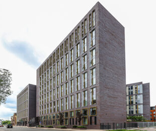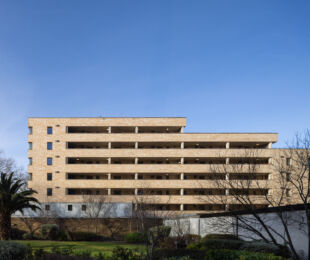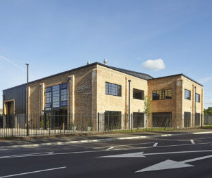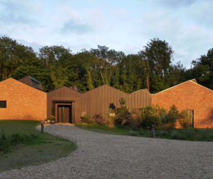
The One Maidenhead development for Get Living is a vibrant addition to Maidenhead town centre, consisting of 429 apartments spread across four distinct blocks. Each block is uniquely defined by its combination of brick colours, yet they collectively convey a sense of unity through the thematic use of panels. The architectural strategy effectively breaks up the buildings’ mass to create a more human scale, using a mix of stock and dark red, buff and brown bricks.
The taller elements of each block feature a primary brick that is complemented by secondary brick panels. These panels, aligned with the window openings, provide visual breaks in the facade, contributing to a more approachable scale. This thoughtful interplay of materials distinguishes each block while maintaining a cohesive overall aesthetic.
A notable feature of the development is the use of white brick on the projecting ends of the blocks facing the public open space to the south. These sections, which are a few stories lower than the main bodies of the buildings, offer a stark yet harmonious contrast. The white brick, combined with the brightly coloured soffits of the projecting balconies, injects a sense of lightness and playfulness into the development. This design choice helps to break down the potential monolithic appearance of the structures, making them more engaging and visually appealing.
At the ground level, the development integrates commercial spaces destined for restaurants, coffee shops, and a supermarket. These areas are marked by the use of glazed green bricks, arranged in vertically and horizontally oriented stretcher bond patterns with chamfered corners. This distinct brickwork not only signifies the publicly accessible areas but also enhances the visual interest and accessibility of the ground floor, drawing visitors into the space.
The intelligent use of diverse brick types is central to the success of the One Maidenhead development. The varied palette of bricks, from dark reds to light buffs and bright whites, humanises the large structures and adds legibility to the site. By carefully balancing unity and distinction, the design transforms what could have been a series of impersonal blocks into a readable, engaging, and inviting addition to the town centre. The development stands as a testament to the versatile and transformative power of brick in modern architecture.


