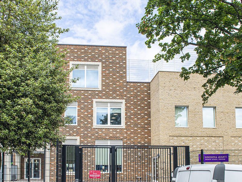
The Krishna Avanti Primary School is a new build, two-form entry Hindu-faith, primary school in Croydon. The school sits on a narrow strip of land between a busy flyover and the Waldrons Conservation Area, a location which has strongly influenced its design. Funded by the Education and Skills Funding Agency with strict area, design and specifcation limitations, there were few opportunities for detail or ‘façade enhancement’ unless justifed by planning and conservation area requirements.
The architects, Cottrell and Vermeulen, designed a simple and linear building along the length of the site consisting of a two-storey classroom block at the upper level of the playground, a three-storey block in the centre and a hall block at the eastern end. Circulation spaces and amenities like toilets and stores were located on the elevation facing the flyover. Existing landscaping was retained as far as possible to cater for a range of play areas, and an additional playground area was set on the roof with a brick parapet and sports fencing.
The simplicity of the design and limitations of the brief, alongside the need to embed the building comfortably in the Conservation Area, entailed a creative use of brick detailing to soften its façade, in keeping with the empathetic feel of a primary school.
The building’s external envelope consists of the high-quality Ibstock, Ivanhoe Cream (buff) brick, a modern interpretation of the prevailing London stock brick found in the conservation area. With variations in colour and texture, the brick loosens and fragments the horizontal lengths of the façade.
Three projecting white brick canopies mark out entrances, echoing the white stucco porches found in the Conservation Area and providing a shelter for visitors and parents. Vertical elements such as the entrances and stair towers were marked out in a contrasting warm Bexhill Purple Multi brick. The brick has inflections of purple, mahogany and dark brown which pick up on the darker tones in the buff/cream brick and the London stock brick in the area. A natural mortar was used to tie the two contrasting bricks together and unify the facade.
A diaper bond pattern in White brick was added to the entrance block and the tower at the change in level to add design and distinctiveness. White brick detailing was also used for the relief entrance porches and as a soldier course to the red areas of brick.
Window apertures in red brick were articulated with white brick window reveals, augmenting a sense of solidity and playfulness to the sombre red. Windows were white aluminium to reflect the white timber frames in the locality and add an iconic retro feel. Many new schools in urban areas have site and funding limitations. With Cottrell and Vermeulen’s creative use of brickwork design, this is a school to inspire connection and learning.


